

Spot the difference
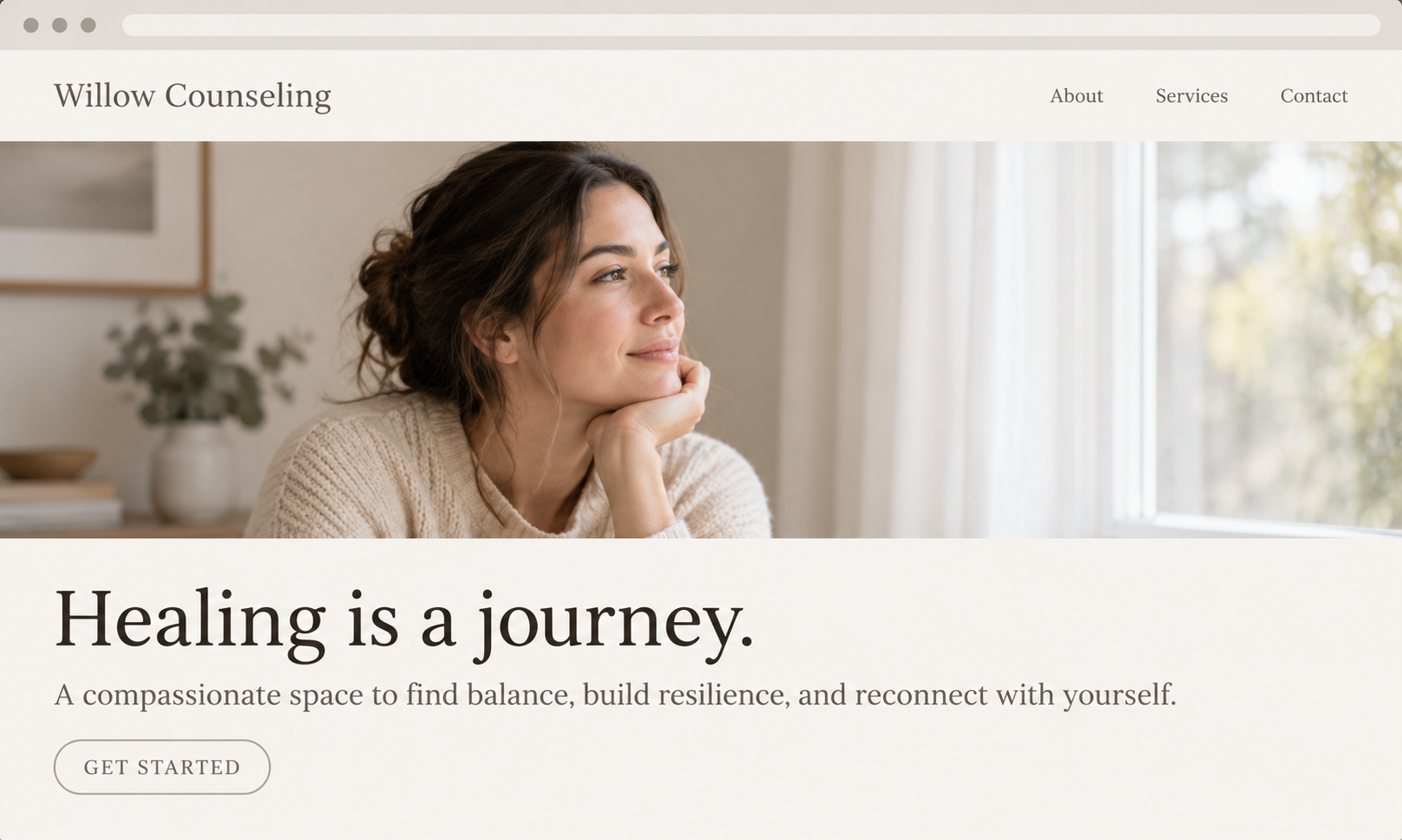
Site A
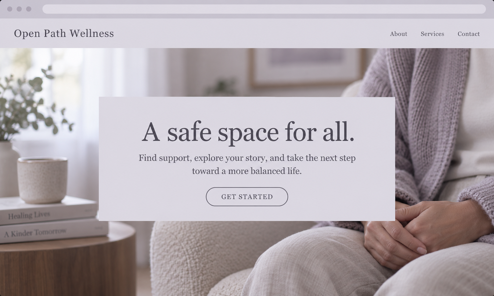
Site B
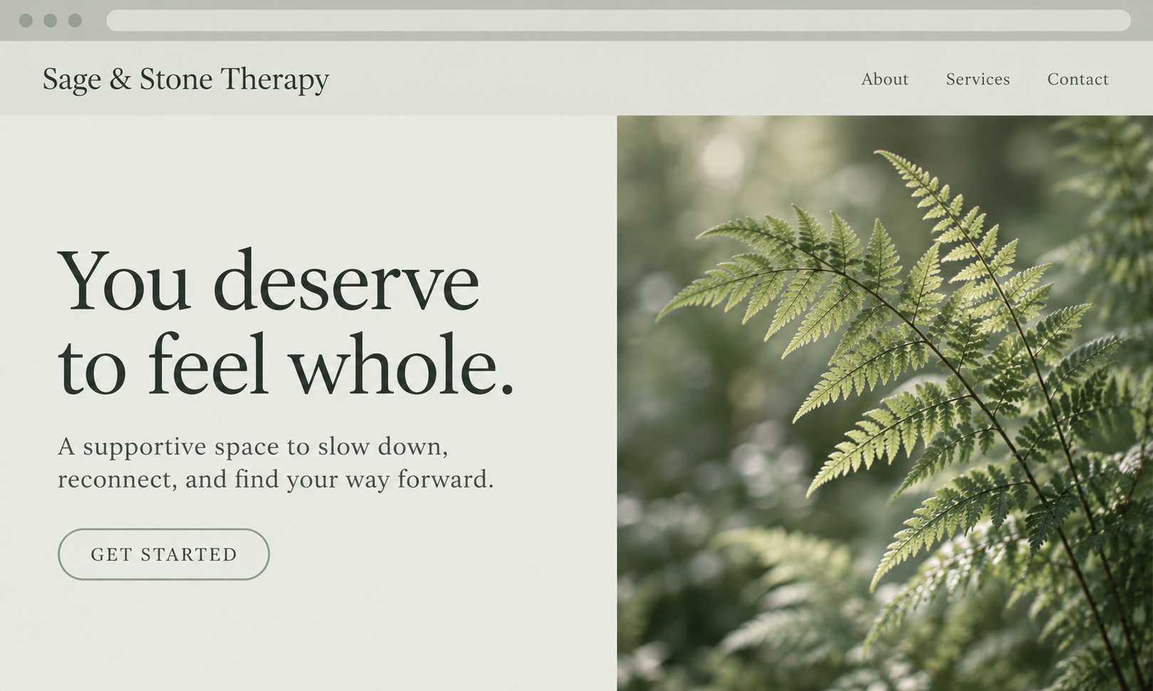
Site C
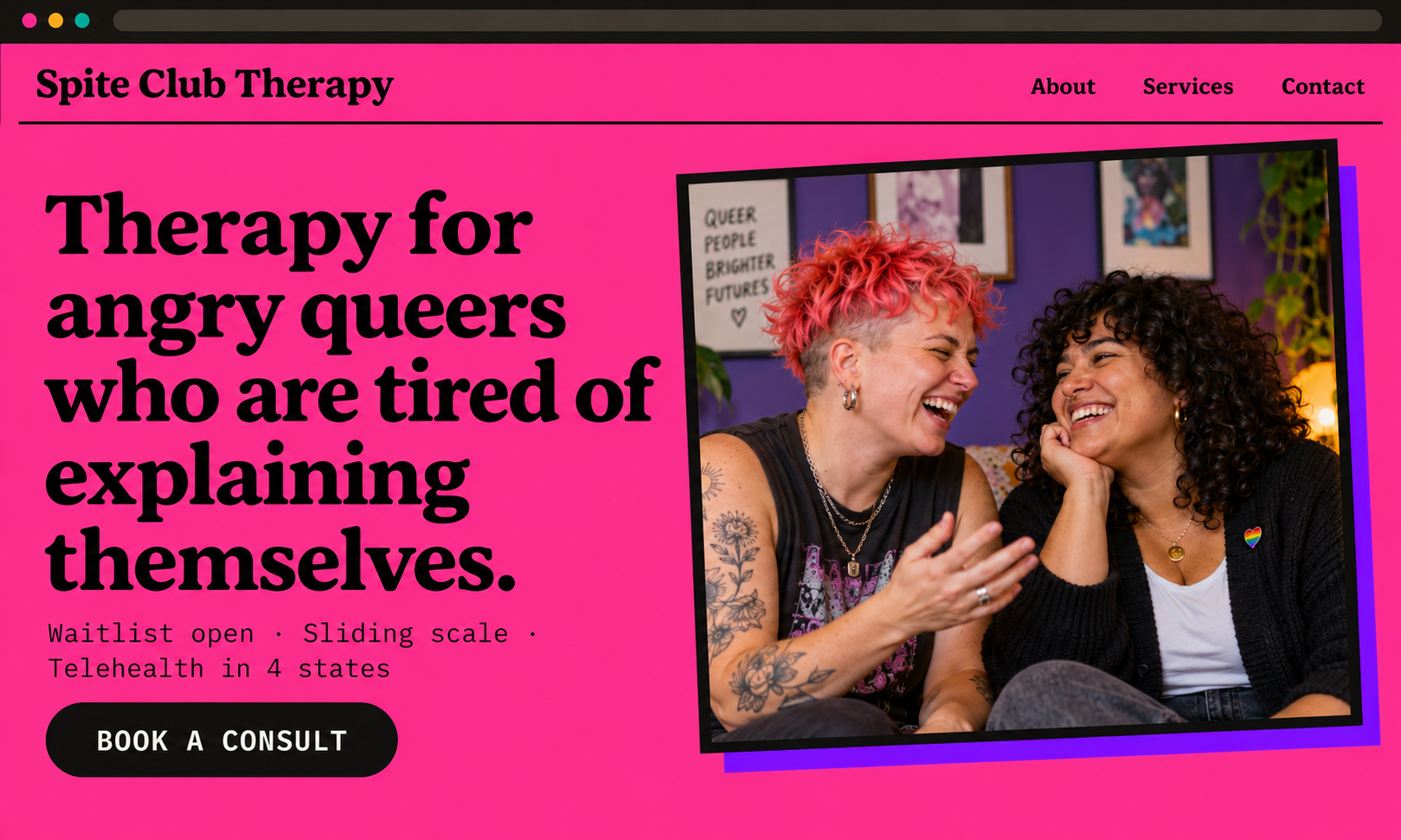
Your Site
“Neutral” has never been neutral
The soft palettes, the couple on the couch, the phrase "a safe space for all" — none of that is the absence of a choice. It's a very specific choice, made so many times it stopped looking like one at all. What it communicates is who the practice was built with in mind, and who is expected to adapt.
Therapy has the same history. Whiteness, straightness, and abledness became the baseline and everything else a variation to be managed. Your clients know that history — many of them have sat in a room where they had to explain themselves before they could get help. They’re reading your website for evidence that this time will be different.
The people who aren’t represented notice immediately.
Example
A site with only white faces may be something a white therapist genuinely never registers. Every client who isn't white clocks it in the first second.
Example
A couples therapist whose photos are all straight couples has flagged the practice as an unknown risk to every queer couple considering it — without saying a word.
Good intentions don't speak. Design choices do — and they speak volumes about our biases and who we quietly treat as the default. A website is an extension of cultural competency, not separate from it.
Design is a signal
"Everyone welcome" is a hope. Naming who you're for is a commitment — and only one of those is verifiable in four seconds.
Specificity is care
Saying "I work with trans adults navigating family estrangement" spares someone the labor of finding out whether you'll get it.
Access is the point
A site a disabled client can't navigate is a closed door, however warm the copy is. Accessibility is part of the welcome, not an add-on.
Challenging the default isn't a stylistic preference I'm imposing on your practice. It's the same work you’re already doing in the room — taken seriously on the page a client sees first.
I can build you the calm, quiet one. I’ve done it plenty.
None of this is a rule I’ll hold you to. If soft and quiet is genuinely right for your practice — and sometimes it is — I know how to make that version well, and I’ll make it without sulking about it. This is your practice, not my portfolio piece.
What I’ll do first is ask why, show you two or three other directions, and let you see them side by side. Then you pick. If you still want the quiet vibes, you’ll at least have chosen it on purpose — which is the whole argument on this page.
Before a potential client reads a word, they're looking for themselves.
If every face on your site is thin, white, able-bodied and straight, you've already answered the question they came to ask — and the answer was no. Most therapy sites do this by accident, because the default stock library is built that way.
So I don't shop the default library. Every project gets an image set chosen for the specific people you treat — queer, trans, disabled, fat, BIPOC, older — licensed, cleared, and captioned properly.
But photos alone can't carry it — and they don't have to.
Most therapy sites use one or two stock images total — the rest are headshots and photos of the actual office. That's fine. Representation isn't a headcount you hit with stock photography, and if it were, no therapist site could pass. Everything else on the page is doing just as much talking.
Copy
Naming communities specifically, using the words they use for themselves, and skipping the euphemisms tells a client more than any photo can.
Color & Type
Warm neutrals, muted greens, soft earth tones — that palette reads as calm to some visitors and as an institution that wasn't built for them to others. Aesthetics carry cultural signals whether we intend them to or not, so we choose yours deliberately.
Structure
What you lead with, what gets its own page, whether pronouns and access details appear at all — every choice about hierarchy is a choice about who you work with.
So when the right image doesn't exist, we don't settle for a wrong one. We say it in the copy and the design instead.
What I do differently
Sameness feels safe when you're anxious about marketing yourself. But a site designed to include “everybody” also compels nobody, and the client who needed you scrolls past.
Your client arrives with one question: will this person get me? I build the site to answer it before they've finished scrolling — in your voice, in colors that aren't apologizing, with photos of people who look like the people you actually treat.
01
Niche-first copy. We name who you're for out loud, on the homepage, above the fold.
02
Imagery with actual people in it. Queer, trans, disabled, fat, BIPOC, older — licensed and cleared.
03
Accessible by default. Real contrast, real alt text, keyboard-navigable, screen-reader tested.
04
Yours to run. Squarespace, so you can edit it at 9pm without emailing a developer.