

Every therapist site looks like it was made for and by the same three people.
Yours won’t.
I build Squarespace sites that actually sound like you and speak straight to the clients you want on your calendar — queer, trans, disabled, BIPOC, neurodivergent, all of the above. No beige. No beach. No stock photo of a woman staring wistfully out of a window.
yours, loudly
〰️
show people who YOU are
〰️
let the right clients find you
〰️
yours, loudly 〰️ show people who YOU are 〰️ let the right clients find you 〰️
Three things every site I build does
Says who it’s for
Your niche, in your words, above the fold — not buried on page four under "specialties."
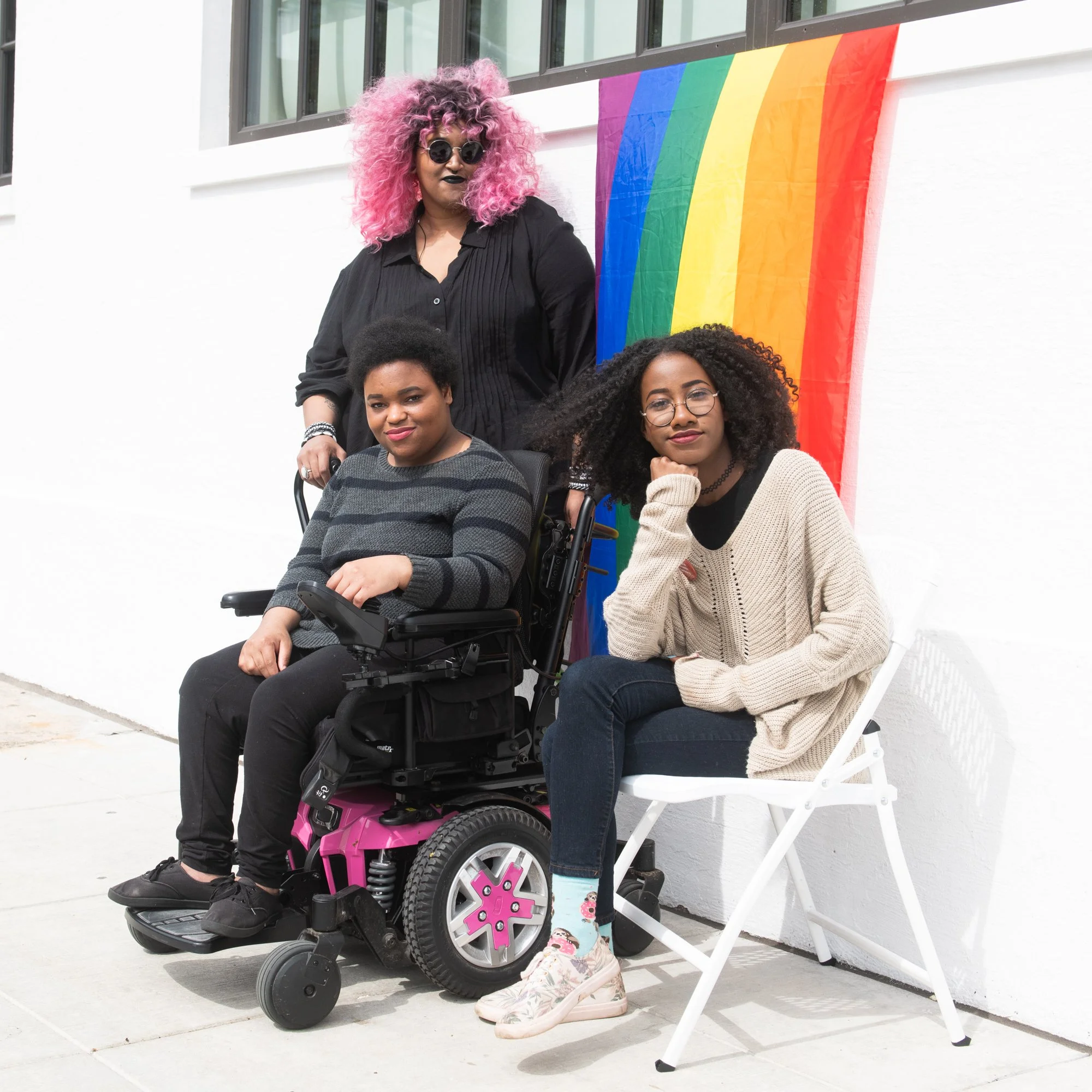
Shows who it’s for
Before a client reads a word, they're looking for themselves. Every project gets imagery of the people you actually treat.
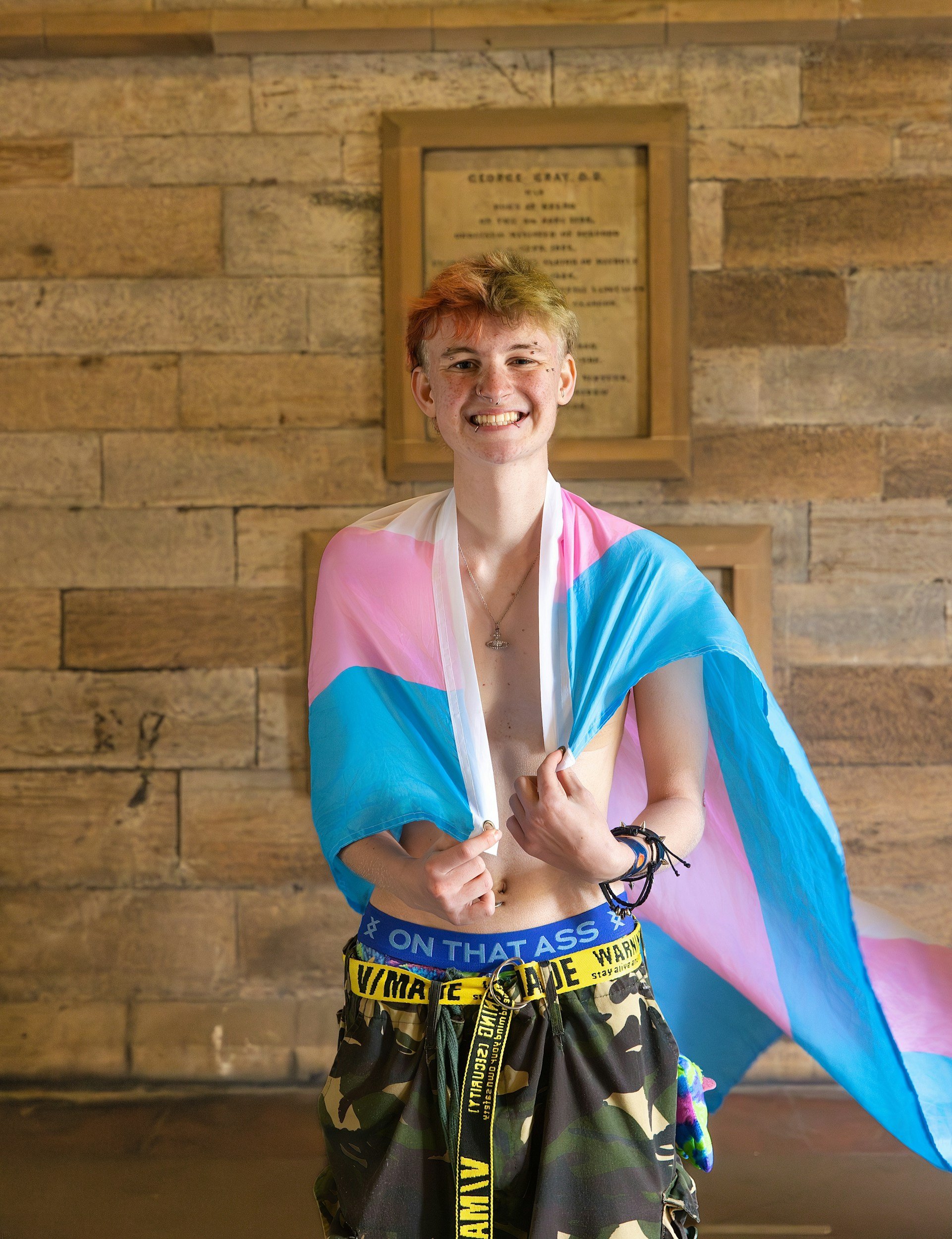
Lets them reach you
Accessible navigation, image alt text, good contrast, no barriers. Accessible because your clients deserve it.

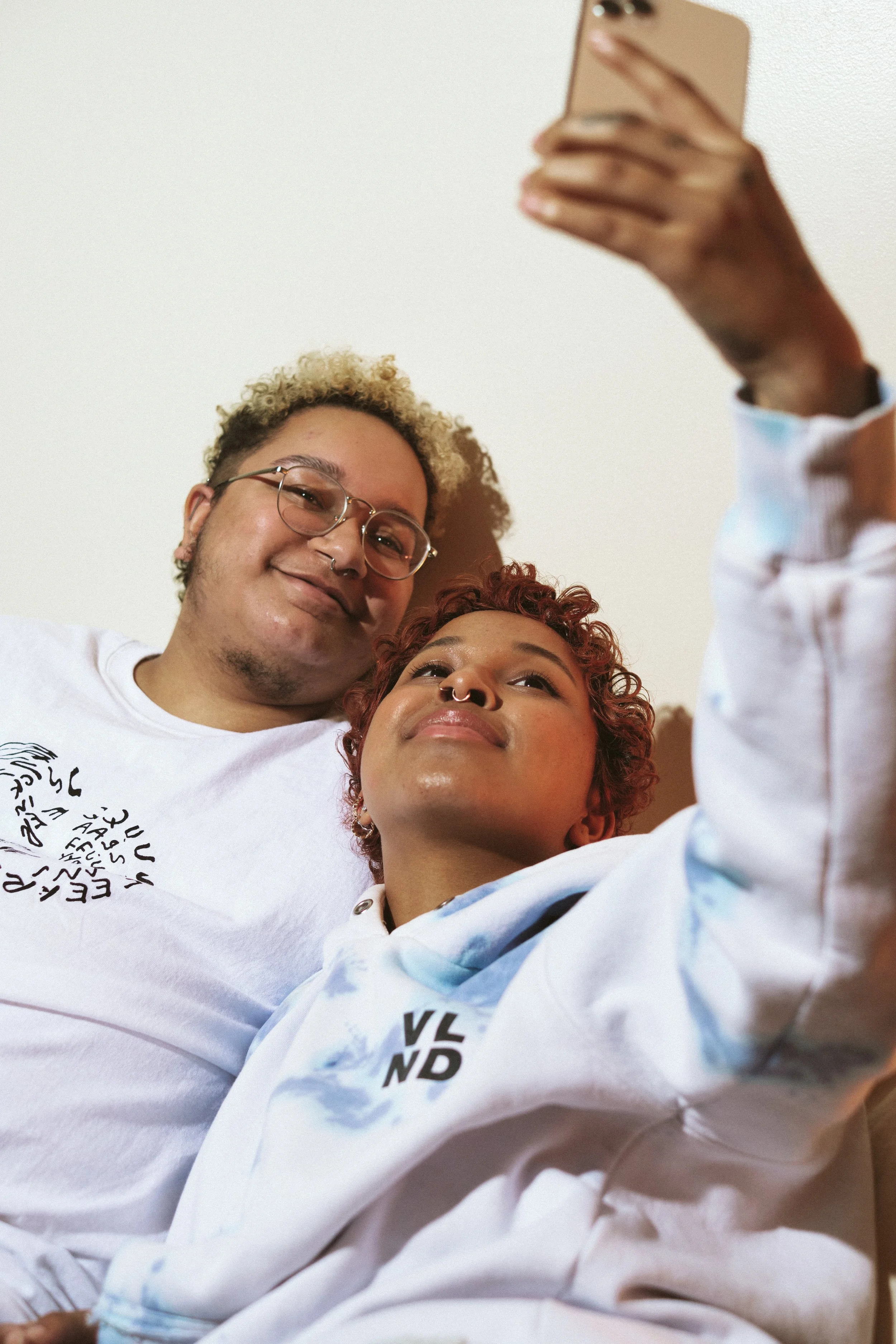
Why this mattersA neutral site attracts nobody in particular
Your potential client isn't googling "therapist." They’re googling whether you'll get it — the transition, the chronic pain, the code switching, the family that doesn't speak to them anymore. Your site has about four seconds to answer.
You're in the right place if you've thought any of this.
My site looks fine but it doesn't sound anything like me.
I know exactly who I want to work with. My website doesn't say so.
I keep getting inquiries from people I'm not the right therapist for.
I've been "about to redo the website" for two years now.
Every photo on my site is a white couple on a couch and I hate it.
All five? We should talk.
Book a call